VISUAL IDENTITY
Alaska Department of Transportation & Public Facilities
Clear. Consistent. Recognizable.
Visual Communication Guidelines define the visual identity of Alaska DOT&PF and ensure every communication reflects the departmentʼs standards and mission.
Visual communication must be held to the same standard as written and spoken communication. How we present ourselves visually shapes how the stakeholders understands and trust our work. It builds credibility, strengthens recognition, and ensures clarity across everything we do.
As the largest state department in Alaska - with a direct impact on communities and travelers statewide - we are responsible not only for delivering essential services, but for communicating clearly, consistently, and professionally. Strong visual standards support transparency, reinforce accountability, and help the public quickly understand what matters.
Visual communication often works below the surface. People recognize brands, interpret color, and form impressions instantly - often without realizing it. That makes consistency and quality essential, not optional.
Department of
Transportation & Public Facilities
Download Branding GuidelinesMemo: Updated Logo and Branding Guidelines
Asset & Typography Library
Click each box to download

- Download entire logo package
- Download large png file (26 in. / transparent background)
- Download small png file (7 in. / transparent background)
- Download large webp file for website use
- Download small webp file for website use

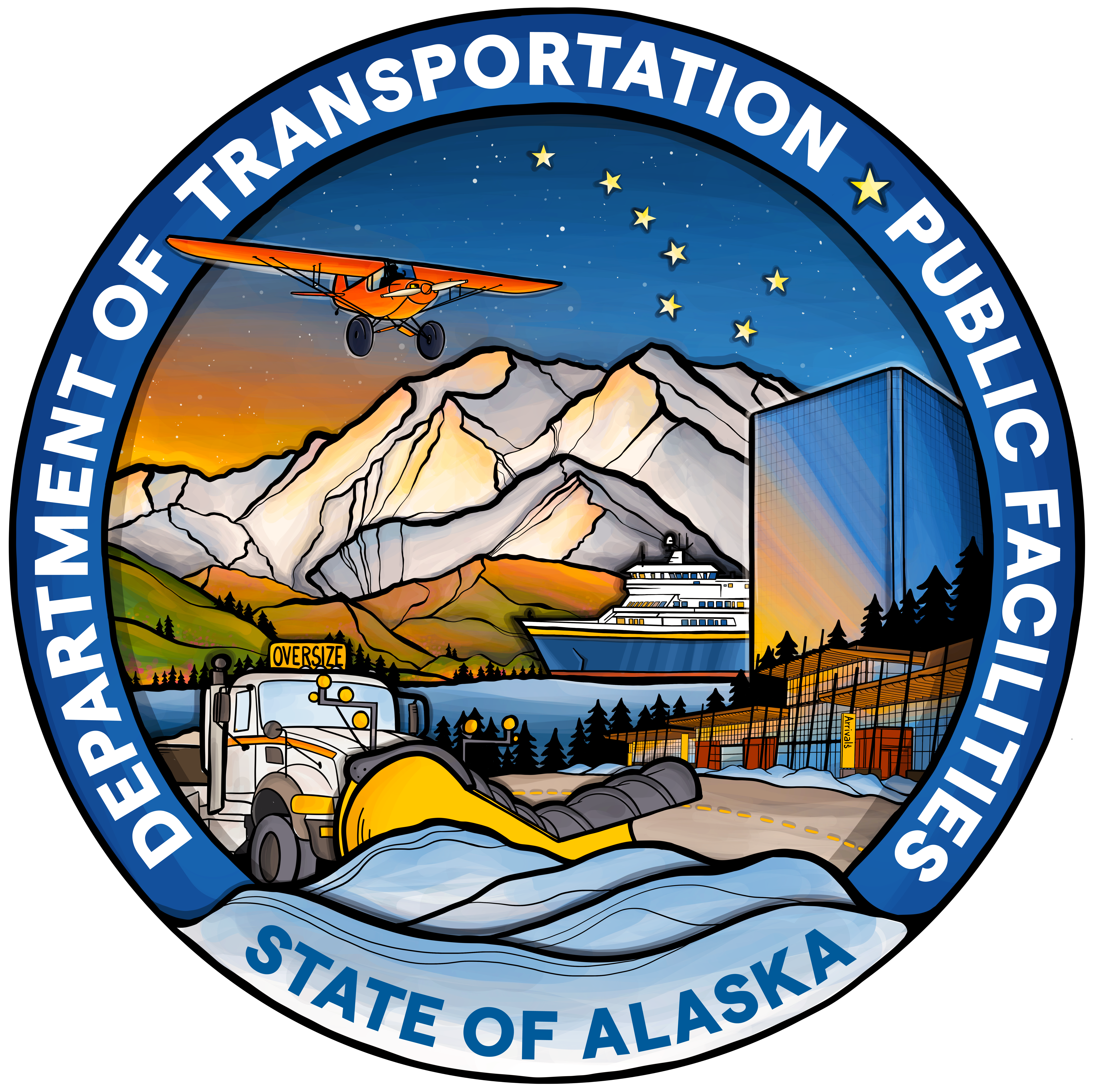
Updated Logo
The new logo is based in the original design - with the purpose to update, not change. The departmentʼs vision was to create a more Alaskan, down-to-earth, illustrated piece that represents all aspects of DOT&PF.
This logo was developed in-house by Karolina Zákravská, a Public Information Officer with a strong focus on visual communications. With nearly a decade of professional experience in graphic design and illustration, Karolinaʼs work spans a wide range of projects across Alaska. Since joining DOT&PF in 2025, she has spearheaded the departmentʼs visual communications overhaul.
WHAT CAN YOU LOOK FORWARD TO?
As we continue to develop and expand our guidelines and the asset library, you will be able to check here for expanded logo package, more guidelines for consultants and contractors you might be working with, and more directives to help unify our overall visual communications.
CLASSIC LOGO PACKAGE
We are not letting the classic logo go quite yet, and we encourage you to use it where it makes sense.
The legacy DOT&PF logo may continue to be used during the period of transition to the new logo. The goal is consistency - not immediate replacement. Please refer to the Visual Communications & Brand Guidelines for more information on how to use our classic, original logo.
The Original Logo and Its Story
Created by a DOT&PF employee Anna Walker for an employee contest. Approximate timeframe: late 90s
Anna Walker began designing the original DOT&PF logo using Microsoft Word, starting with a simple circle shape that allowed her to wrap text around its edge. She then added color and incorporated clip art elements - including a plane, a building to represent public facilities, and a mountain - to symbolize the departmentʼs broad scope.
Through experimentation with various techniques in Word, she gradually developed the logo layout. She mentioned that she worked on the design over the course of about a month, refining it until she reached a version she was satisfied with. The airplane featured in the final logo was not part of the original design; the initial version used a different aircraft type, but it was changed to a Goose following feedback from department leadership.
Walker originally hoped to include an image of Mount Denali in the design but was unable to find a suitable graphic.
This was not a professionally contracted design project but rather part of an internal employee contest to create the departmentʼs first official logo. Among several submissions, Walkerʼs stood out as the only one created digitally, while the others were hand-drawn. Her design was ultimately selected because it effectively represented all areas of DOT&PF while being ready for practical use.
Walker created this logo at a time when graphic design was rapidly evolving with emerging technology. For its time, it was a strong and forward-thinking piece of work, reflecting Annaʼs curiosity and initiative as she developed her skills. The department is grateful for her contribution, which marked an early step in establishing a visual identity nearly three decades ago.
DOT&PF Lunch and Learn
Branding Guidelines and Logo Use
DOT&PF Lunch and Learns are the department’s way of sharing knowledge, highlighting internal expertise, and keeping employees informed on important topics, tools, and initiatives across the agency. Below are links to two sessions hosted on Branding Guidelines and Logo Use.
September 2025 Modernized Logo Release and Branding Training